In the latest release of Silverlight Charts, new features took a backseat to stabilizing our architecture and improving performance. For the intrepid developer the time is right to take the plunge and start experimenting with your own series.
Beware: Silverlight charts is still in preview mode and there may be breaking changes in the future despite our best efforts to avoid them.
In this series of blog posts I will explain how to implement your own series in Silverlight charts. I will assume you already know how to create Silverlight controls and are familiar with Silverlight/WPF concepts such as the visual tree and templating. If you aren't comfortable with these concepts I advise you to drop by www.silverlight.net and make your way through the excellent tutorials.
Introducing the Stock Series
One of the series that is available in Excel but is currently missing from Silverlight Charts is the Stock Series. The stock series displays a high, low, and close value on a given day. Here's an example from Excel:

Let's see if we can implement the stock series using the extensibility points provided by Silverlight Charts.
"Designers, Designers, Designers!"
One of the biggest benefits of Silverlight is that control developers can decouple a control's model and its visual appearance. This means that designers can use tools like Expression Blend to give our controls the professional treatment. Finally design-challenged developers can create glassy, beveled controls that impress our clients, friends, and family.
Our goal is to take advantage of Silverlight to give the designer as much flexibility as possible to customize our series' appearance. This post explains how to do this.
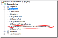
Setting up the Project
First create a new Silverlight project and import the System.Windows.Controls.DataVisualization.Toolkit.dll from the newest version of the Siverlight Toolkit.
Now we're ready to start adding the files we need for our Stock Series.
Creating the StockSeries Control
One of the things to keep in mind about Silverlight Charts is that everything is a control. In addition to the Chart control which acts as a container, each individual series and the axes they use are also controls. This is great news for designers because they can completely change the visual appearance of a control by replacing its template. It's also great news for developers because the Control base class provides a variety of useful methods and properties.
Since our StockSeries is a control we need to go through the same steps required to create any control in Silverlight:
1. Add the StockSeries Class
using System.Windows.Controls.DataVisualization.Charting;

namespace CustomSeries
{
    public class StockSeries : Series
    {
        public StockSeries()
        {
            this.DefaultStyleKey = typeof(StockSeries);
        }

        public override void  Refresh()
        {
        }
    }
}
Our StockSeries inherits from the abstract Series base class, which in turn inherits from Control. The only method we need to implement is the "Refresh" method. When this method is called a series is expected to go back to its data source and render everything from scratch. We'll get to this method later.
2. Add a Default Style for the StockSeries Control.
a) Add a folder called "Themes" to the root of the project.

b) Add a new XAML file called "generic.xaml" under the root.

c) Add a resource dictionary with a default style for the StockSeries class to the "generic.xaml" file
<ResourceDictionary
    xmlns:x="http://schemas.microsoft.com/winfx/2006/xaml"
    xmlns="http://schemas.microsoft.com/winfx/2006/xaml/presentation"
    xmlns:local="clr-namespace:CustomSeries">

    <Style TargetType="local:StockSeries">
    </Style>
</ResourceDictionary>
d) Set the build action of "generic.xaml" to "Resource".

3. Add a Default Template for the StockSeries class
A control's template contains the objects used to render its visuals. Since a StockSeries plots objects in two dimensional space it makes sense to include a Canvas in its template. The StockSeries will use this canvas to arrange its data points.
In order to add a template to our StockSeries control we must add a setter to the default style in the "generic.xaml" file.
    <Style TargetType="local:StockSeries">
        <Setter Property="Template">
            <Setter.Value>
                <ControlTemplate TargetType="local:StockSeries">
                    <Canvas x:Name="PlotArea" />
                </ControlTemplate>
            </Setter.Value>
        </Setter>
    </Style>
Now that we've added the canvas to our StockSeries template we will declare that it is a "Template Part" by adding the TemplatePart attribute to the top of our class.
    [TemplatePart(Name = "PlotArea", Type = typeof(Canvas))]
    public class StockSeries : Series
"What's a Template Part?"
A Template Part is an object that must be present for a control to operate properly. The StockSeries can't do very much without a canvas to plot its points in, right? Adding the TemplatePart attribute above to our class is our way of saying "Hey designers! You can replace the template to this class if you want, but make sure to add a Canvas with the name 'PlotArea' in there somewhere."
4. Grabbing the PlotArea Canvas Object
When our template is applied we'll need to retrieve a reference to the our "PlotArea" Canvas object so that we can use it to lay out our data points. We'll store this reference in a private property so that we can use it later.
private Canvas PlotArea {get; set;}
We retrieve a reference to the canvas object when our template is applied so we can be sure that it exists.
public override void  OnApplyTemplate()
{
    base.OnApplyTemplate();
    this.PlotArea = GetTemplateChild("PlotArea") as Canvas;
}
Now we've created a StockSeries that can be customized by a designer! They can change the background color, add borders, embellish it with images, or whatever.
Customizing the template for the StockSeries is nice, but keep in mind that the series is really just a container. The real fun is in customizing the appearance of the data points. In order to give designers this ability we'll create another control for our data points.
Creating the StockDataPoint Control
The StockDataPoint looks something like this:

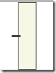
Let's create a simple default template for our StockDataPoint that a designer can replace later. The series will set the height of our stock data point and we want to ensure that our template scales gracefully to any size. Let's start by creating a grid, splitting it into three columns, and inserting a rectangle in the middle. This gives us the following visual appearance:

Now let's add another grid on top and divide in into four columns.

We want to insert our line into the second column so that sticks out of the left-hand side of the rectangle. We would also like it to stretch to the full width of the column it is in. Unfortunately if we set the line to stretch it will do so vertically and horizontally which means that it will always appear in the center of the column like so:
This won't do because we need to be able to change the vertical position of the line based on the "Close" value. To accomplish this we nest the line inside of another grid. By setting the vertical alignment of this grid to top and the vertical alignment of the line to bottom we can control the vertical position of the line by adjusting the height of the inner grid.

Voila. It's not too pretty but that's not important because a designer can replace it with something really impressive later.
Let's take a look at the default style XAML in "generic.xaml."
    <Style TargetType="local:StockDataPoint">
        <Setter Property="Width" Value="10" />
        <Setter Property="Background" Value="Beige" />
        <Setter Property="Foreground" Value="Black" />
        <Setter Property="Template">
            <Setter.Value>
                <ControlTemplate TargetType="local:StockDataPoint">
                    <Grid Width="{TemplateBinding Width}" Height="{TemplateBinding Height}">
                        <Grid>
                            <Grid.ColumnDefinitions>
                                <ColumnDefinition />
                                <ColumnDefinition />
                                <ColumnDefinition />
                            </Grid.ColumnDefinitions>
                            <Grid.RowDefinitions>
                                <RowDefinition />
                            </Grid.RowDefinitions>
                            <Rectangle Grid.Column="1" Grid.Row="0" Fill="{TemplateBinding Background}" Stroke="{TemplateBinding Foreground}" />
                        </Grid>
                        <Grid>
                            <Grid.ColumnDefinitions>
                                <ColumnDefinition />
                                <ColumnDefinition />
                                <ColumnDefinition />
                                <ColumnDefinition />
                                <ColumnDefinition />
                            </Grid.ColumnDefinitions>
                            <Grid.RowDefinitions>
                                <RowDefinition />
                            </Grid.RowDefinitions>
                            <Grid VerticalAlignment="Top" Grid.Row="0" Grid.Column="1" Height="{TemplateBinding CloseCoordinate}">
                                <Line VerticalAlignment="Bottom" X1="0" Y1="0" Stretch="Fill" X2="1" Y2="0" Stroke="{TemplateBinding Foreground}" StrokeThickness="3">
                                </Line>
                            </Grid>
                        </Grid>
                    </Grid>
                </ControlTemplate>
            </Setter.Value>
        </Setter>
    </Style>
We expect the StockSeries to size and place the data point such that the top is at the high position and the bottom is at the low position. The series will also set the "CloseCoordinate" property of our StockDataPoint to the correct value when it updates a data point. This will control the vertical position of the line.
Now let's create a StockDataPoint class which inherits from Control:
    public class StockDataPoint : Control
    {
        public StockDataPoint()
        {
            this.DefaultStyleKey = typeof(StockDataPoint);
        }

        public DateTime Date
        {
            get { return (DateTime)GetValue(DateProperty); }
            set { SetValue(DateProperty, value); }
        }

        public static readonly DependencyProperty DateProperty =
            DependencyProperty.Register(
                "Date",
                typeof(DateTime),
                typeof(StockSeriesDataPoint),
                new PropertyMetadata(default(DateTime)));

        public double High
        {
            get { return (double)GetValue(HighProperty); }
            set { SetValue(HighProperty, value); }
        }

        public static readonly DependencyProperty HighProperty =
            DependencyProperty.Register(
                "High",
                typeof(double),
                typeof(StockSeriesDataPoint),
                new PropertyMetadata(0.0));

        public double Low
        {
            get { return (double)GetValue(LowProperty); }
            set { SetValue(LowProperty, value); }
        }

        public static readonly DependencyProperty LowProperty =
            DependencyProperty.Register(
                "Low",
                typeof(double),
                typeof(StockSeriesDataPoint),
                new PropertyMetadata(0.0));

        public double Close
        {
            get { return (double)GetValue(CloseProperty); }
            set { SetValue(CloseProperty, value); }
        }

        public static readonly DependencyProperty CloseProperty =
            DependencyProperty.Register(
                "Close",
                typeof(double),
                typeof(StockSeriesDataPoint),
                new PropertyMetadata(0.0));

        public double CloseCoordinate
        {
            get { return (double)GetValue(CloseCoordinateProperty); }
            set { SetValue(CloseCoordinateProperty, value); }
        }

        public static readonly DependencyProperty CloseCoordinateProperty =
            DependencyProperty.Register(
                "CloseCoordinate",
                typeof(double),
                typeof(StockSeriesDataPoint),
                new PropertyMetadata(0.0));
    }
The "Date" property stores the date on which the data in the data point was collected. This value will be used to determine where the data point appears on the X axis. It is sometimes called the independent value.
The "High", "Low", and "Close" values are called dependent values, because they depend on the date on which they are taken.
The "CloseCoordinate" property is the vertical coordinate relative to the top of the data point where the line in the data point located. Our StockSeries class will set this value to the location of the Close property as reported by the Y axis.
A Designers Dream
Now we've empowered designers by giving them ability to completely change the appearance of our series and data point controls using Microsoft Expression Blend. If you're lucky enough to have an in-house designer they could even get started right away while you finished implementing the series.
Coming in Part 2: We implement the StockSeries class and starting charting some data!
Coming in Part 3: We make our StockSeries dynamic, responding to changes in the underlying data source with smooth animations.

4 comments:
Also check out this implementation of the stock chart for SLTK
http://www.codeproject.com/KB/silverlight/SLTCandlestickChart2.aspx
The charting team is aware of this CodePlex article. We were actually quite excited to see it as we are evaluating the pros and cons of opening our DataPointSeries hierarchy. :-)
The reason I'm seemingly reinventing the wheel here is that the article implements a stock series using classes which are sealed. Customers have to download the source and rebuild.
The other reason to write this article is that in this release our axis interfaces have changed quite a bit so that one is somewhat out of date.
At the moment the Charting team is not comfortable opening our own DataPointSeries hierarchy. We are concerned that protected members may change in the future and we don't want to lead customers down this path.
By contrast we don't expect any changes in the series base class or any major changes in the existing interfaces for axes beyond some new members (maybe).
Hi Jafar,
Can this be adapted to support candlestick charts?
Please continue posting blogs on charting. Your post on creating chart series is very good. Look forward for more posts on the same lines.
Post a Comment