Boys and girls, its the most wonderful time of the year: a new version of Silverlight is shipping. Silverlight 3 shipped today along with a refresh of the Silverlight Toolkit. For this release I had the pleasure of writing the Rating control which is available in both the Silverlight 2 and 3 versions of the Toolkit. In this post I'll give you a high level overview of how Rating works and how you can customize it.
Using Rating
The Rating control is located in the System.Windows.Controls namespace in System.Windows.Controls.Input.Toolkit.dll. Once you've added a XAML namespace you can create a Rating like this...
<inputToolkit:Rating ItemCount="5" />
This will create a Rating control with five stars:
Giving Rating a Value
The Rating control has a Value property which is a ratio from 0 to 1. The Value property is a nullable double. In other words the Value property is either between 0% and 100% or it is null.
The Rating control has two selection modes: Continuous and Individual. In Continuous mode (the default) the control behaves the way most star-based Rating controls do: filling the first two stars and half of the middle one.
<inputToolkit:Rating ItemCount="5" Value="0.5" SelectionMode="Continuous" />
However in individual mode, the stars leading up to the middle star are not filled:
<inputToolkit:Rating ItemCount="5" Value="0.5" SelectionMode="Individual" />
Individual mode is useful when you want to offer discrete selection options:
Adding Rating Items
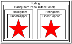
Rating is an ItemsControl with an ItemCount convenience property which adds instances of RatingItem to the Items collection. Therefore this...
<inputToolkit:Rating ItemCount="5" />
...is equivalent to this...
<inputToolkit:Rating>
   <inputToolkit:Rating.Items>
      <inputToolkit:RatingItem />
      <inputToolkit:RatingItem />
      <inputToolkit:RatingItem />
      <inputToolkit:RatingItem />
      <inputToolkit:RatingItem />
   </inputToolkit:Rating.Items>
</inputToolkit:Rating>
...and this:
var rating = new Rating { ItemsSource = new[]{"", "", "", "", ""} };
ItemCount is convenient if you don't need to bind your rating items to an underlying data source or otherwise vary their appearance. However since RatingItems are content controls if you do bind to a data source your data will be displayed below the RatingItem.
var rating = new Rating { SelectionMode = RatingSelectionMode.Individual, ItemsSource = new[]{"Hate", "Bored", "Good", "Great", "Love"} };
The Template
The Rating ItemsControl uses instances of the RatingItem class as its item container. RatingItem inherits from ContentControl and its template contains an instance of the LinearClipper control. The LinearClipper control is used to hide a portion of the star in the RatingItem template.
In addition to the common visual states the RatingItem control has a "Fill States" visual state group which contains the following states: "Empty", "Partial", and "Filled."
The LinearClipper has a property ExpandDirection which can be used to determine whether it expands Up, Down, Left, or Right. By changing this property along with the ItemPanelTemplate property of Rating you can customize Rating to display and reveal stars vertically.
As Rating is an ItemsControl all the tricks you already know to customize an ItemsControl's appearance apply. I won't rehash how to style an ItemsControl here, there's plenty of information on MSDN. For comprehensive examples of re-templated Rating controls you can take a look at the Rating sample page in Silverlight Toolkit samples.
Rate Rating
Rating is being released under the "Preview" quality band. That means we're looking for feedback on ways in which we can improve it. Try it out and let us know what you think on the CodePlex forums.


7 comments:
Post a Comment